In May of 2018, I had just left a permanent (office-based) role for the opportunity to work from home full-time. Little did I know that only 2 years later it would have become more of a mandate than a preference. Especially for those working in the service sector.
One year into the pandemic, I felt like my internet connection's speed and reliability had taken a perceptible toll by comparison to what I had experienced during the previous 2 years.
This felt especially noticeable when sharing screen shots and recordings with colleagues via Jira and Slack. These files were usually no bigger than 5 to 100 MB a piece, but would take what felt like an eternity to upload.
I figured given the increase in people now working from home, and the litany of video calls that came with it. It was likely there's greater demand for upstream bandwidth in my local area, which Virgin Media was failing to meet sufficiently.
Regardless of the exact cause, I thought it was worth attempting to continuously monitor my internet connection's performance for posterity and to satisfy my own curiosity.
I had a disused Raspberry Pi 3 Model B I was intending to use as the platform for my monitoring device. However, it only had 100 Base Ethernet which tops out at 100 Mbit/s, and therefore would be insufficient for measuring my 350 Mbit/s connection.
I ended up opting for a Raspberry Pi 4 Model B with Gigabit Ethernet which future-proofed my setup to the tune of 1000 Mbit/s.
The original incarnation of this project involved manually installing and configuring the following packages:
- Speedtest CLI - for performing the speed tests and gathering metrics
- Node.js - for executing Speedtest CLI, parsing the JSON output, and inserting data in InfluxDB
- InfluxDB v1 - for storing and querying the collected data points
- Grafana - for visualizing and plotting graphs of the data points
However, recently I rebuilt this project from scratch and made the following improvements:
- Automated the provisioning of these services via Ansible .
- Ported the speed test script from Node.js to Python, removing the need for another package.
- Migrated the existing data to InfluxDB v2.
- Ported the chart queries from InfluxQL, to the new Flux scripting language.
With the monitoring device in place, it began collecting speed test data starting on 2021-04-15 and I largely forgot about it, only checking the dashboard occasionally to see how things were trending in the short term.
On the main dashboard, I surfaced some of the data collected in the following graphs. Here you can see a snapshot of the full dashboard with the first 90 days worth of data. Below are the individual panel charts embedded separately.
Some caveats when looking at this data:
Speedtest CLI will automatically select the "best" server to run a speed test against unless you force it to use a specific server with the
-s, --server-idoption.However, I avoided using a fixed server in order to gather data from a variety of server locations. With new and old servers on their network coming and going all the time, a manually selected server could eventually go offline, requiring I select a new one to replace it (hassle).
Only some servers provide packet loss data points, meaning there will be some gaps in the packet loss data points. I contacted Ookla to ask if there's a way to target only servers that provide this information, they said it is not possible currently. 🤷🏼♂️
There are too many data points in these graphs to show all of them verbose. So they are sampled using the following
aggregateWindowfunction which we'll explore more later on.aggregateWindow(every: v.windowPeriod, fn: mean, createEmpty: false)
Packet Loss
Ping
Jitter
Download Speed
Download Speed by Server
Upload Speed
Upload Speed by Server
I think what is especially enlightening, are the graphs that show the speed data by server.
They paint a picture that speed is a very subjective thing, it appears to depend heavily on which server your client is testing against. There also seems to be less deviation in the results when focusing on a particular server.
For instance in the Download Speed by Server chart if you focus on the line showing the results from server 29080 - Leicester you'll see the result oscillates around 160 Mbit/s.
By comparison the result for 311171 - Watford oscillates closer to the ceiling of my connection around 380 Mbit/s.
So... given I now have ~20 months worth of data, can we actually use it to find a correlation between the trend in more people working from home in the UK, and my upload speed taking a dive?
Let's start by taking the original Flux query for the Upload Speed chart.
from(bucket: "speed_tests")
  |> range(start: v.timeRangeStart, stop: v.timeRangeStop)
  |> filter(fn: (r) => r._field == "upload_bandwidth")
  |> map(fn: (r) => ({
    _value: r._value / uint(v: 125000),
    _field: r._field,
    _time: r._time
  }))
  |> aggregateWindow(every: v.windowPeriod, fn: mean, createEmpty: false)
This Flux query is getting all the measurements in the speed_tests bucket, between v.timeRangeStart and v.timeRangeStop, these variables will be set by the time range controls in Grafana.
Out of all the measurements recorded by the speed test script in InfluxDB, we only want the upload_bandwidth field, which according to the speedtest man page uses bytes per seconds as the unit of measurement.
To convert bytes per second to megabits per second we divide the field's _value by 125000, because 1 Megabit == 1,000,000 bits == 125,000 bytes. Also In the map function we're filtering out the other metadata attached to the measurement as additional tags and fields, such as Server ID, etc.
Lastly as there's too much raw data to retrieve and display all of it efficiently. So we're using the aggregateWindow function, to sample the data within a given period.
This means we are effectively bucketing all the data points in a given time window of v.windowPeriod in size (which is set dynamically based on this formula Time range / max data points).
Our time range is 2021-11-01 to 2022-05-01 which is 546 days, the maximum number of data points in this period is 847. So 546 days / 847 points = 0.644 days. This gets rounded to 12h given the evaluated query presented in the inspector.
from(bucket: "speed_tests")
  |> range(start: 2020-11-01T00:00:00Z, stop: 2022-04-30T23:00:00Z)
  |> filter(fn: (r) => r._field == "upload_bandwidth")
  |> map(fn: (r) => ({
    _value: r._value / uint(v: 125000),
    _field: r._field,
    _time: r._time
  }))
  |> aggregateWindow(every: 12h0m0s, fn: mean, createEmpty: false)
The data points in these 12h buckets is aggregated through a given function (fn) in this case. In this case we're taking the average of this bucket with the mean function.
This means the final data points shown on the chart the result of these 12h bucket averages.
At this scale of 18 months, the 12 hour period is producing too much noise making obfuscating the general trend.
If we increase this period to 1 week (1w) we start to see more of a smoother curve, revealing a better picture of the general trend.
|> aggregateWindow(every: 1w, fn: mean, createEmpty: false)
Now we have that lets look for some data to correlate with. I initially found this chart for Timeline of UK government coronavirus lockdowns and restrictions provided by the Institute for Government.
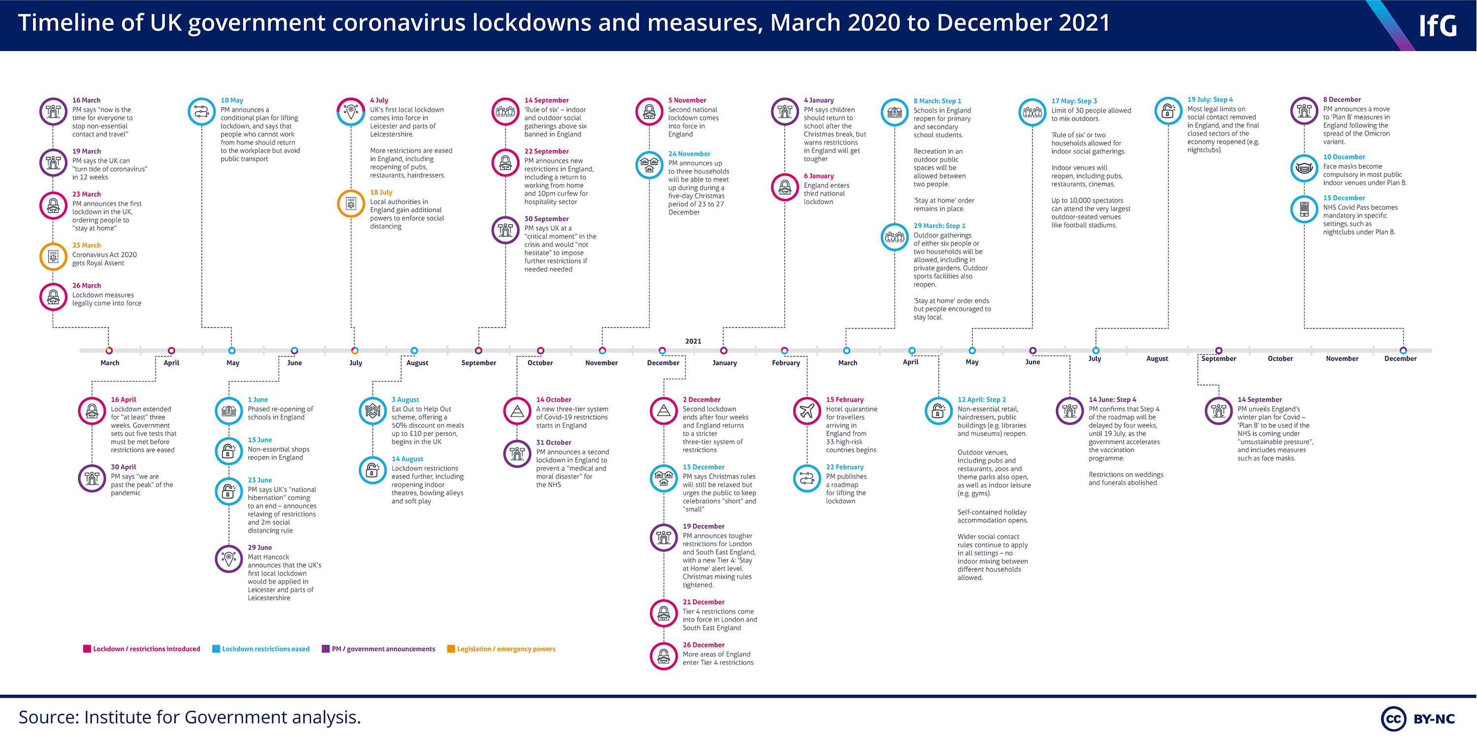
This infographic provides a nicely presented overview of significant dates in the UK, categorized as follows:
- Lockdown / restrictions introduced
- Lockdown restrictions eased
- PM / government announcements
- Legislation / emergency powers
Unfortunately the data encapsulated in this chart is not provided in an easy to reuse format such as a CSV. So laboriously, I painstakingly went through the chart copying and pasting the data into a line protocol formatted text file, that I could then write into a new InfluxDB bucket called lockdown_events.
That lockdown_events.lp file can be found here, if anyone else wants it.
I wrote the data to InfluxDB with the following commands.
# Creates the new InfluxDB bucket to house the data
$ influx bucket create -n lockdown_events

# Write the data to the new bucket
$ influx write \
--bucket lockdown_events \
--precision s \
--format lp \
--file lockdown_dates.lp
Now we have some context for what was happening in the UK around this time how can we overlay this on the chart?
Well Grafana provides annotations , which can be powered by data source queries.
So lets setup two query-powered annotations one for the Lockdown / restrictions introduced events and another for Lockdown restrictions eased events.
These are the two respective queries used.
from(bucket: "lockdown_events")
  |> range(start: v.timeRangeStart, stop: v.timeRangeStop)
  |> filter(fn: (r) => r.type == "Lockdown / restrictions introduced")
from(bucket: "lockdown_events")
  |> range(start: v.timeRangeStart, stop: v.timeRangeStop)
  |> filter(fn: (r) => r.type == "Lockdown restrictions eased")
For these annotations I colored them red and green so they can be differentiated on the graph. If you hover over the arrows at the bottom you can see the text description of the event it relates to.
Retrospectively we can see I started monitoring around the time things began to get progressively better, with restrictions continuing to be lifted and not reintroduced after the third and final national lock down.
These annotations are useful for context, but what we really want to know is how many people were working from home around this time?
Well luckily for me there's some data provided by the Office for National Statistics that I discovered in the this article titled Is hybrid working here to stay?.
Under the header "The proportion of workers hybrid working has risen slightly during spring 2022" there is a relevant chart embedded. This data also approximately lines up with the time I started monitoring my internet connection.
In addition to presenting this data in a chart, they also provide the raw data points as an xlsx file. I wrote a basic script to parse it and format it for ingestion into a new InfluxDB bucket called wfh_percentages.
I have made the parsed data available as this wfh_percentages.lp file, which can be found here.
After adding an the following query to pull in this new data, and formatting it as a dual axis graph we can now see everything together.
from(bucket: "wfh_percentages")
  |> range(start: v.timeRangeStart, stop: v.timeRangeStop)
From this bird's eye view I would say there is a minor correlation between people returning to the office for work and an improvement in my average upload speed.
The only other subtle thing of note is there was a spike in people working from home around the holiday period of December of 2021. My upload speed had reached a relatively stable equilibrium between 2021-11-08 and 2022-04-28, aside from a slightly dip which correlates with the after mentioned spike.
So I guess the moral of the story is you should start monitoring before things they get perceptibly worse. 😅
If you are also interested in monitoring your internet connection in the same manner demonstrated here. I have published this project on GitHub here.
This project is effectively a tool that will allow you to quickly and easily provision your own Raspberry Pi to periodically measure your internet connection. It also presents the measurements in the same way my main dashboard does through Grafana.
Anyway if you made it to the end of this post, thank you for reading!